Treat W3C WCAG 2.2 as systems architecture, not a post-launch overlay
Accessibility overlays and late-stage remediation scripts routinely fail both assistive-technology users and enterprise compliance audits. At Radiaix, our UI/UX and frontend engineering teams bake W3C Web Content Accessibility Guidelines (WCAG 2.2) directly into the component primitives, color tokens, and keyboard focus graphs from day one.
When engineering clinical compliance platforms like Vector Health Compliance and insurance underwriting portals like TUIC Insurance Portal, accessibility is inseparable from operational speed: keyboard operators, screen-reader users, and field staff on mobile touchscreens all rely on deterministic landmarks, unambiguous link labels, and high-contrast visual hierarchy.
- Enforce a strict, high-contrast token palette that guarantees >= 4.5:1 normal text and >= 7:1 AAA contrast across dark and light surfaces.
- Structure every route with a single <main id="main-content" tabindex="-1"> target, a visible-on-focus skip link, and uniquely labeled <nav> landmarks.
- Eliminate scroll-linked opacity fades on interactive containers so buttons and copy maintain full contrast at every scroll position.
- Support Windows High Contrast Mode via @media (forced-colors: active) system color fallbacks.
Master the new WCAG 2.2 keyboard, focus, and pointer target rules
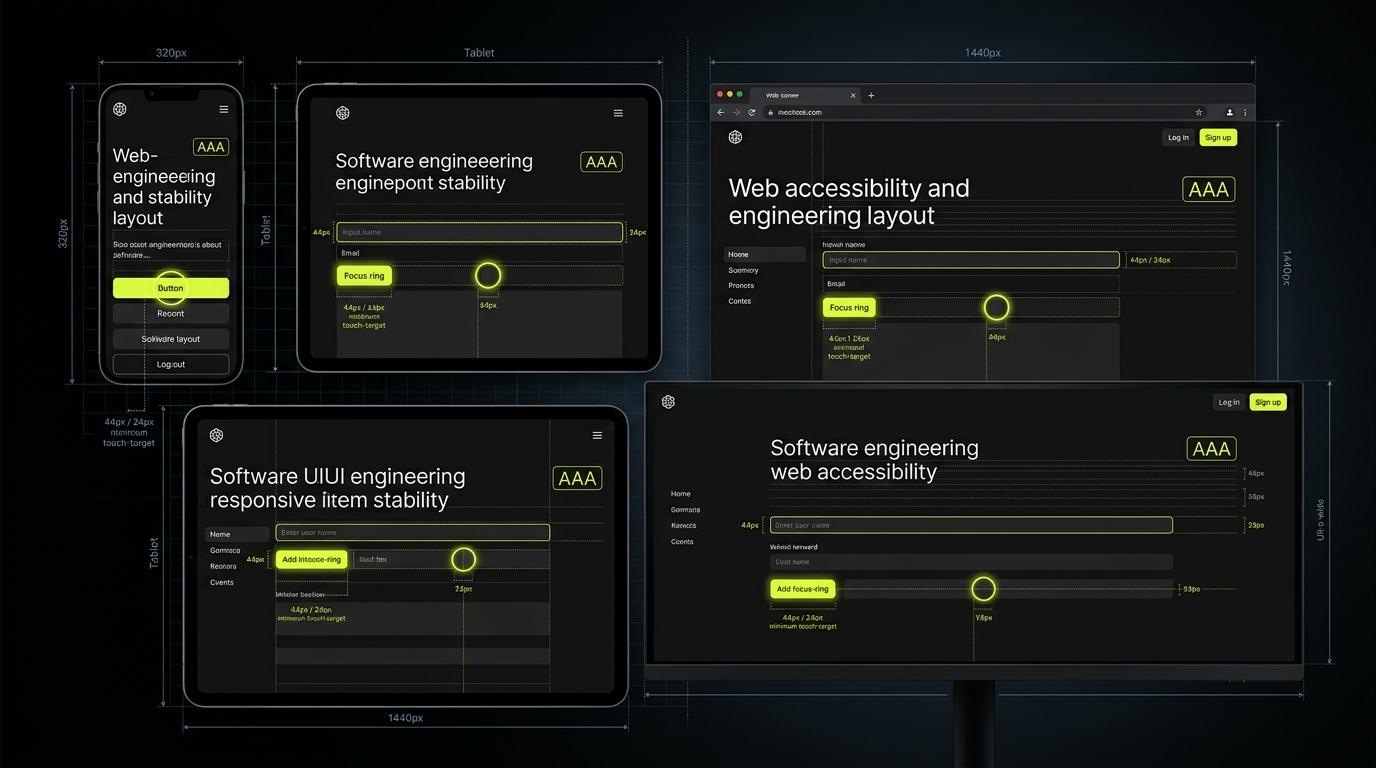
WCAG 2.2 introduced critical requirements addressing real-world failure modes in modern sticky-header SPAs and dense data tables—specifically SC 2.4.11 Focus Not Obscured, SC 2.4.13 Focus Appearance, SC 2.5.7 Dragging Movements, and SC 2.5.8 Target Size (Minimum).
In Radiaix production builds, we configure scroll-padding-top on the document root so fixed navigation headers never obscure keyboard-focused controls, pair 3px :focus-visible outlines with contrasting halos so focus rings remain unmistakable on any background, and enforce a 24×24 CSS pixel floor (scaling to 44×44px on coarse touch pointers) across every breadcrumb, filter pill, and checkbox.
If a keyboard user cannot see where focus landed, or a touch user mis-taps a 16px breadcrumb link, the interface has a structural bug—not an edge case.
Align visible labels and accessible names for speech-input and screen-reader users
Automated scanners often miss semantic mismatches that break voice-control software (such as Voice Control on macOS/iOS or Dragon) and screen-reader rotor lists. Under W3C SC 2.5.3 (Label in Name), a button's programmatic accessible name must contain its exact visible text string.
Similarly, under SC 2.4.4 and SC 2.4.9 (Link Purpose), repeating generic 'Explore' or 'Case Study' links that point to different URLs forces screen-reader users to guess each destination. Radiaix solves both simultaneously by keeping the visible CTA concise and appending a visually hidden .sr-only entity suffix after the visible label.
- Never override visible button text with a conflicting aria-label that breaks voice-recognition commands.
- Append .sr-only context suffixes (e.g., 'Explore service: Software Development') to disambiguate repeated card CTAs.
- Overlay native <input type="checkbox"> elements directly across custom pill labels with inset: 0; opacity: 0 rather than 1×1px off-screen hacks.
- Provide explicit <caption> and <th scope="col"> semantics on all data and directory tables.
Lock in zero regressions with 39-viewport Playwright + axe-core pipelines
Accessibility conformance degrades rapidly if it relies on manual spot checks. Radiaix embeds @axe-core/playwright and custom DOM geometry assertions directly into our CI verification suite—testing every template across 39 viewport presets ranging from 320×568 compact mobile screens to 3840×2160 4K displays.
Every deployment verifies zero color-contrast violations, zero horizontal reflow overflow at 320px (SC 1.4.10), >= 44px touch targets on mobile navigation and legal toolbars, and complete Schema.org structured data parity.
How Radiaix Engineered Accessible, Audit-Ready Interfaces for Vector Health & TUIC
Healthcare and insurance operators needed dense, high-speed web portals that remained effortless to navigate via keyboard, screen readers, and mobile tablets without sacrificing visual polish.
Radiaix architected semantic HTML5 workflows, WCAG 2.2 compliant focus and target-sizing systems, and automated multi-viewport Playwright verification suites.
Key Engineering Takeaways
Related Radiaix Systems, Services & Technical References
Explore how Radiaix automates WCAG 2.2 accessibility, visual regression, and E2E Playwright testing.
See how Radiaix engineered an audit-ready clinical compliance and governance web platform.
Inspect Radiaix's accessible policy management and claims workflow portal.
Read our companion blueprint on pre-release QA gates and automated regression pipelines.
Official W3C Recommendation defining WCAG 2.2 Level A, AA, and AAA success criteria.
Frequently Asked Questions
What is the biggest difference between WCAG 2.1 and W3C WCAG 2.2?
WCAG 2.2 adds nine new success criteria—most notably SC 2.5.8 Target Size Minimum (24×24 CSS pixels), SC 2.4.11/2.4.12 Focus Not Obscured by sticky headers, SC 2.4.13 Focus Appearance, SC 2.5.7 Dragging Movements, SC 3.2.6 Consistent Help, and SC 3.3.8 Accessible Authentication—while retiring the obsolete 4.1.1 Parsing rule.
Can Radiaix audit and remediate our existing web application for WCAG 2.2 AA compliance?
Yes. Radiaix performs full-site W3C WCAG 2.2 audits combining automated axe-core Playwright scans across all routes and viewports with deep semantic remediation of contrast, keyboard focus, ARIA landmarks, forms, and target sizing.